Quick Start
Step 1: Installation
In your React Native (or Expo) project, install the Zephyr library:
- NPM
- Yarn
- pnpm
npm install react-native-zephyr
yarn add react-native-zephyr
pnpm add react-native-zephyr
See the Installation guide for more details on installation.
Step 2: Wrap your app in a StyleProvider
Then wrap your app in a StyleProvider instance, which is used by Zephyr under the hood (for things such as dark mode support).
import { StyleProvider } from "react-native-zephyr";

export const App = () => {
  return (
    <StyleProvider>
      {/* The rest of your app body... */}
    </StyleProvider>
  );
};
Step 3: Create a Style Builder
Then use the createStyleBuilder method to generate styling helpers. We recommend you have a single Zephyr instance for your entire app, so it's best to create your styling utilities in a dedicated file and export what you need for the rest of your app to consume.
import { createStyleBuilder } from "react-native-zephyr";

export const { styles, useStyles, makeStyledComponent } = createStyleBuilder();
These three styling helpers work similarly under the hood, and can be used in various scenarios. We'll start by wrapping some standard React Native UI components with our makeStyledComponent helper so that we can hit the ground running.
import { createStyleBuilder } from "react-native-zephyr";
import { View, Text } from "react-native";

export const { styles, useStyles, makeStyledComponent, styled } = createStyleBuilder();

// Export some styled components
export const StyledView = makeStyledComponent(View);
export const StyledText = makeStyledComponent(Text);
These new, wrapped components (StyledView and StyledText) expose classes and darkClasses props that allow you to pass in baseline style classes, as well as style classes to be merged in dark mode.
Step 4: Start styling!
With your new style helpers (see Default Classes and Default Theme for more info on style classes you get out of the box), you can quickly style elements.
import * as React from "react";
import { StyledView, StyledText } from "./styles";

export const MyComponent = () => {
  return (
    <StyledView
      classes={["flex:1", "bg:purple-100", "justify:center", "items:center"]}
      darkClasses={["bg:purple-800"]}
    >
      <StyledText
        classes={["text:5xl", "color:gray-800"]}
        darkClasses={["color:gray-100"]}
      >
        Hey world
      </StyledText>
    </StyledView>
  );
}
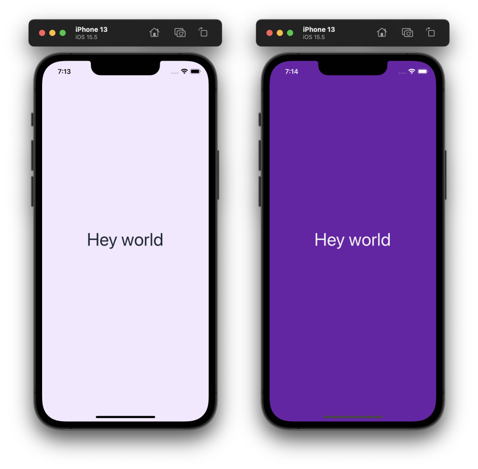
This small amount of React will generate the following (left: in light mode, right: in dark mode).

tip
IMPORTANT! The createStyleBuilder function returns multiple core utilities that you can use for styling. We recommend you check out the Styling Methods to learn about the different ways you can use Zephyr to style UI elements. These include:
- A raw function
stylesthat transforms a list of classes to a style object. - A hook
useStylesthat wrapsstylesand provides dark-mode support. - The
makeStyledComponentfunction shown here. - A
styledmethod that provides an API similar to Styled Components (but for React Native).
Step 5: Customizing your theme
Zephyr ships with a suite of default style classes that use the default theme to create the applicable style "classes" (such as "w:4"). This default theme is overridable and extendable. To override the default theme constraints, you can pass an overrideTheme argument to createStyleBuilder.
import { createStyleBuilder } from "react-native-zephyr";

const { styles } = createStyleBuilder({
  overrideTheme: {
    spacing: { sm: 4, md: 8, lg: 16 }
  }
});

// Now the spacing helpers, like m: and p:, use the spacing constraints above.
styles("px:sm", "py:md", "m:lg");
Note that by passing a constraints field, such as spacing or colors, you'll override the respective default theme constraints. See Extending the theme for more details on how this works. If you want to just extend the default theme constraints, use the extendTheme parameter.
import { createStyleBuilder } from "react-native-zephyr";

const { styles } = createStyleBuilder({
  extendTheme: {
    colors: { brand: "#ff00ff" }
  }
});

// The default colors are available, alongside your added colors.
styles("color:red-300", "bg:brand");
Step 6: See what else there is to offer!
Zephyr has a lot more to offer! Here are some things to check out:
- Check out the default classes and default theme to see what styles come for free out of the box.
- Check out the styling methods that are available.
- Learn more about how to extend the default theme.
- Learn about the dark-mode support that comes for free.
- Learn about the clsx-like syntax for applying dynamic class names to an element.
- Learn about adding extra style handlers to extend the default style classes even further.